Friday, March 11, 2011
Tuesday, January 25, 2011


Tuesday, December 14, 2010
Photoshoot images
I have used a black and white theme for the images as i want them to look sophisticated and swarve. (The James Bond Look.) I have increased the contrast of the images to a high level as i wanted the black and white colours from the image to really contrast against each other, which would make the photography more bold and to stand out well from the background.
I have also used lighting effects which has also helped create the effect that i wanted to. I have used butterfly lighting which help creates a glamourous lighting effect. It enhances the light on the face. Creating a subtle butterfly lighting look on the face. I have also used lighting to attract light in to certain area's of the photo that i wanted to lighten or draw attention to.
On photoshop i experimented with a filter, called Diffuse Glow. This added a nice soft glow to my images which added the extra lighting needed to create the soft photo effect that i
wanted.

The costume as you can see i have gone for a posh suit, which works well for my character. I have added in some geek chic glasses to contrast with the posh suit, in some images. I feel this would be the outfit that my artist would choose to wear. (Plus i am going for the James Bond look.)
I also have experimented with some of the images. I have picked out colour on some of the images. I feel this would work well as the colour theme of the magazine and photo-shoot would match.


I have experimented with this image by editing the female model so it appears 'Kai' is resting on the models legs. I was inspired by the james bond image earlier on in my blog. I feel this image portrays the type of character that my artist is, a cool, confident character that is a bit of ladies man.
Thursday, December 9, 2010
Magazine questionnaire
Create your free online surveys with SurveyMonkey, the world's leading questionnaire tool.
Wednesday, December 8, 2010
Page Layout + Contents Page research


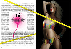


From researching and looking at these layout designs, i have learnt that there are many different ways of displaying and laying out contents page and pages. You do not always need to stay in a boxes and be all square and straight with your designs. There are so many other possibilities. For example, looking at the last image the contents page is side ways along the bottom of the page. This is very unusual but stands out and looks very creative.
Subscribe to:
Posts (Atom)